Making the ‘why’ easier to find
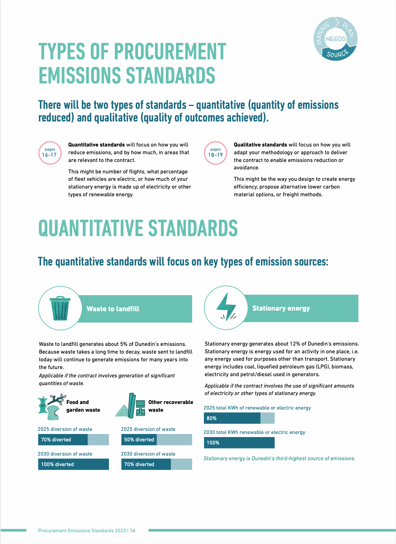
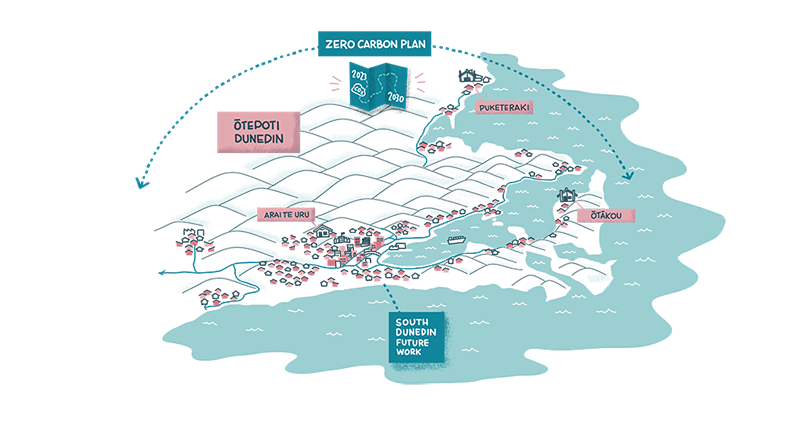
My client wanted suppliers and the community to understand the bigger picture behind changes to their policy. They sought help to create an informative companion brochure that clearly spelt out these updates and what they mean for everyone involved.
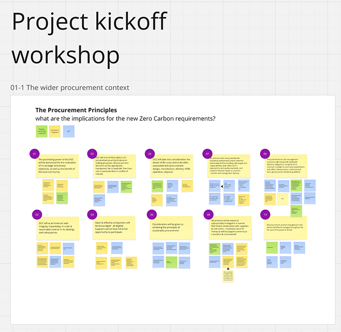
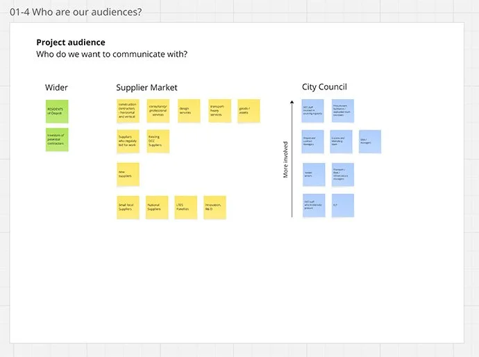
Deciding what ‘good’ looks like: I created a ‘design sprint’ style workshop for us to analyse the audience, map their needs, and see what works well. This gave us a clear set of principles to guide the rest of the project.
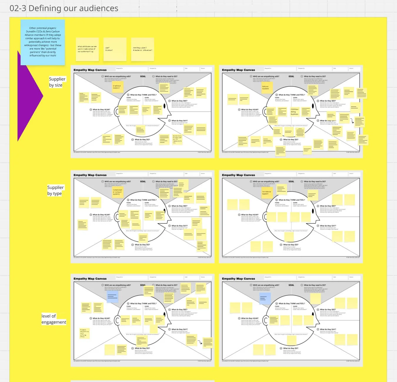
Empathy map canvas by Dave Grey
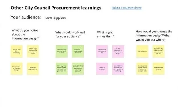
We analysed other documents to learn about what works
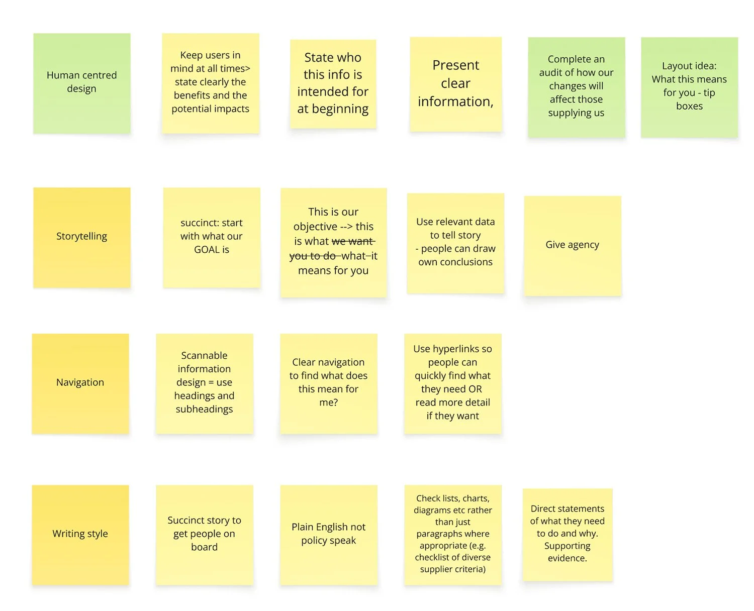
Our document design principles
Developing the story: With guidelines in place, we broke down the technical information into a logical, step-by-step story. The project team then wrote the copy while I sketched out the initial illustrations to match the narrative. We kept in contact with the internal comms department to make sure we were meeting guidelines for accessibility and content.
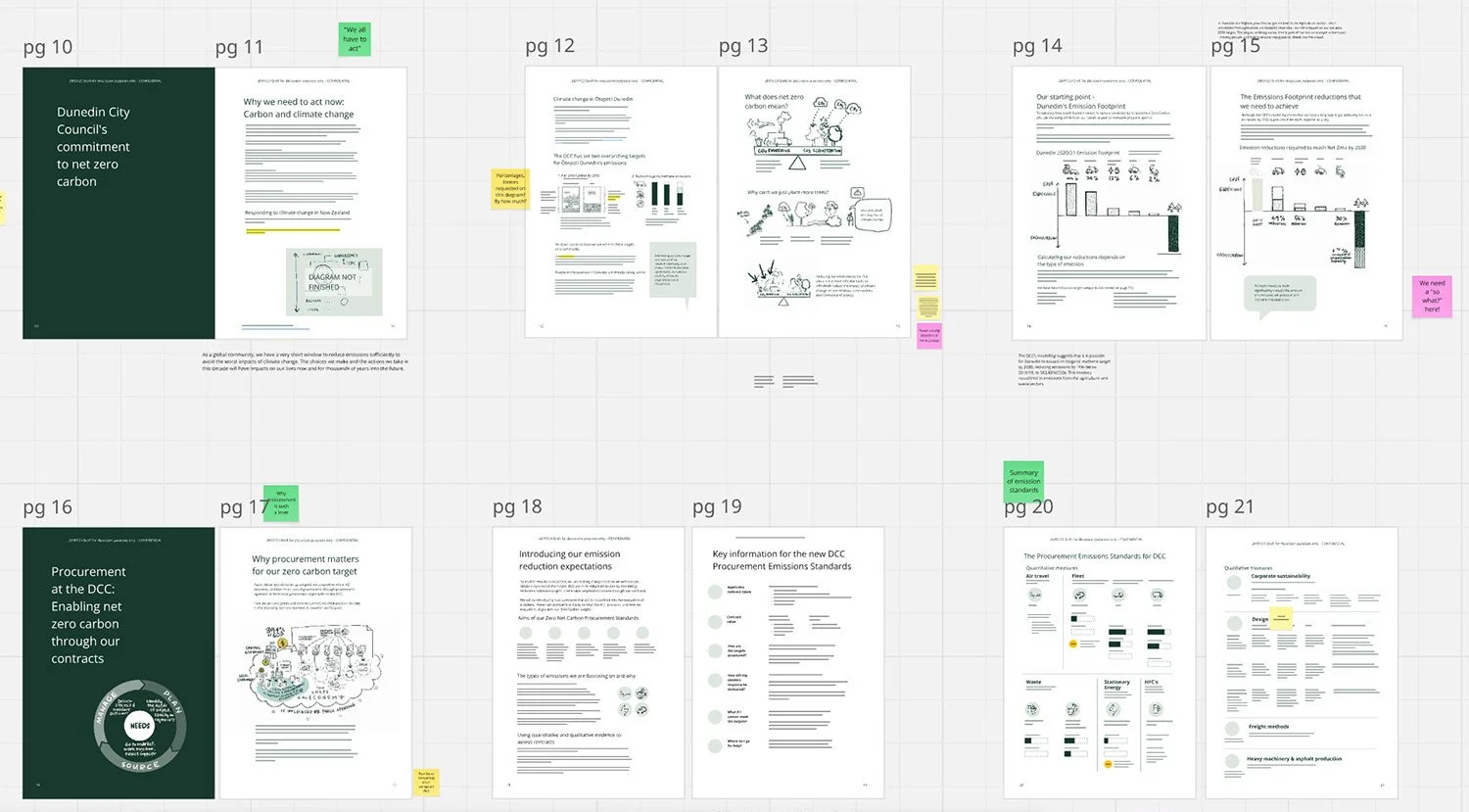
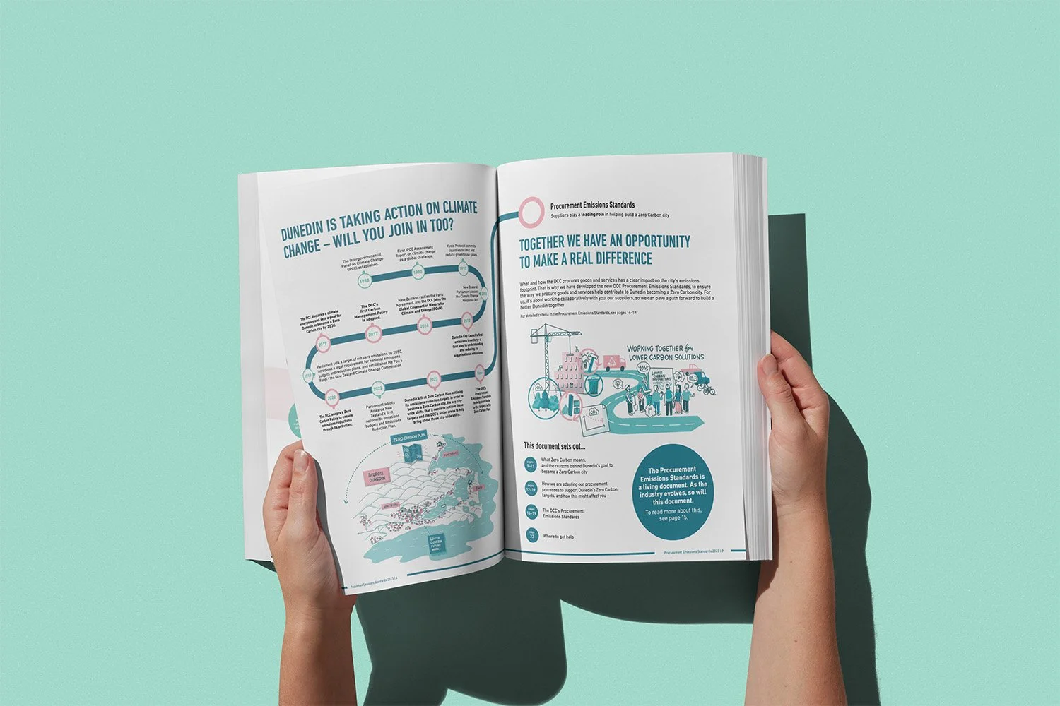
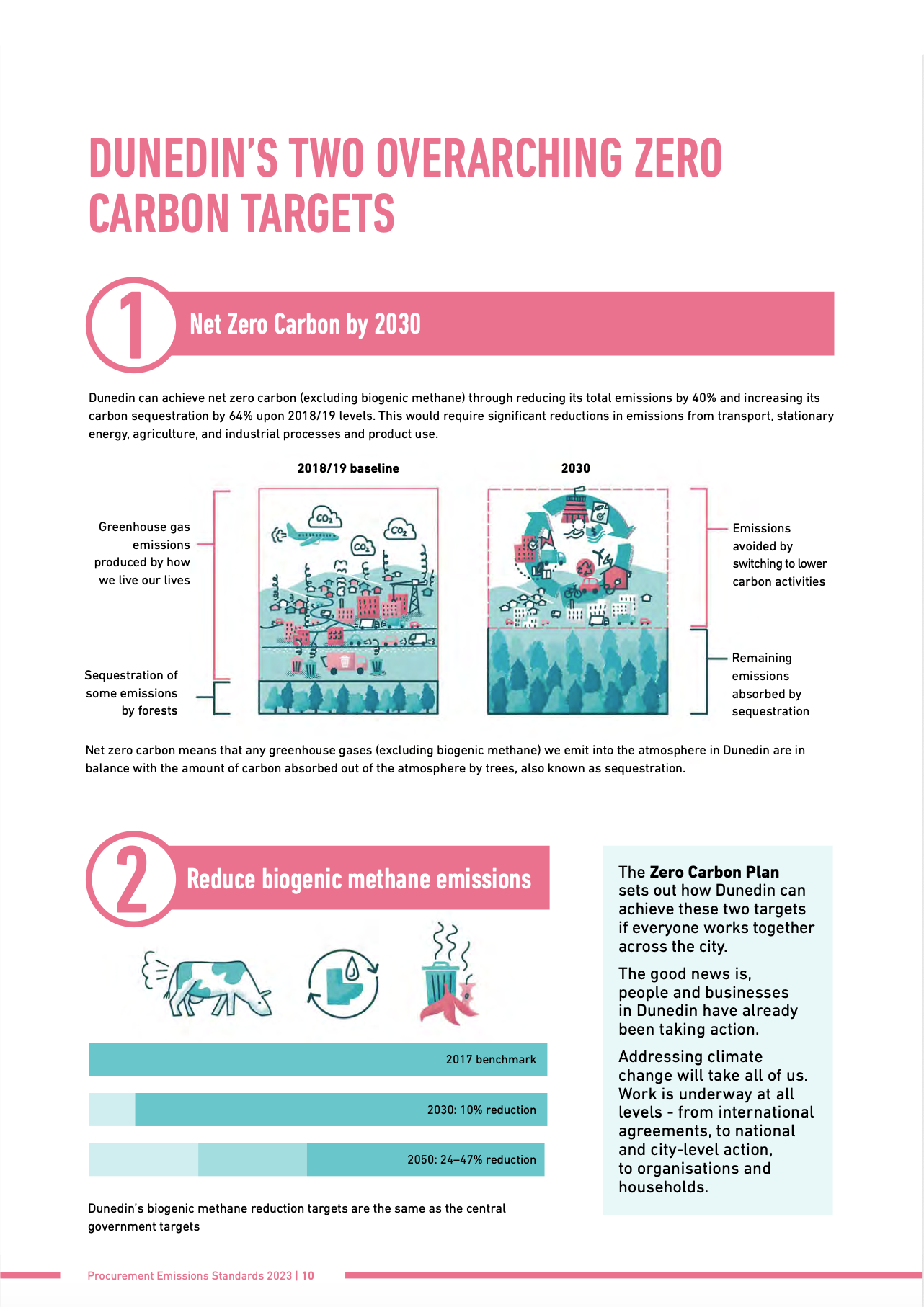
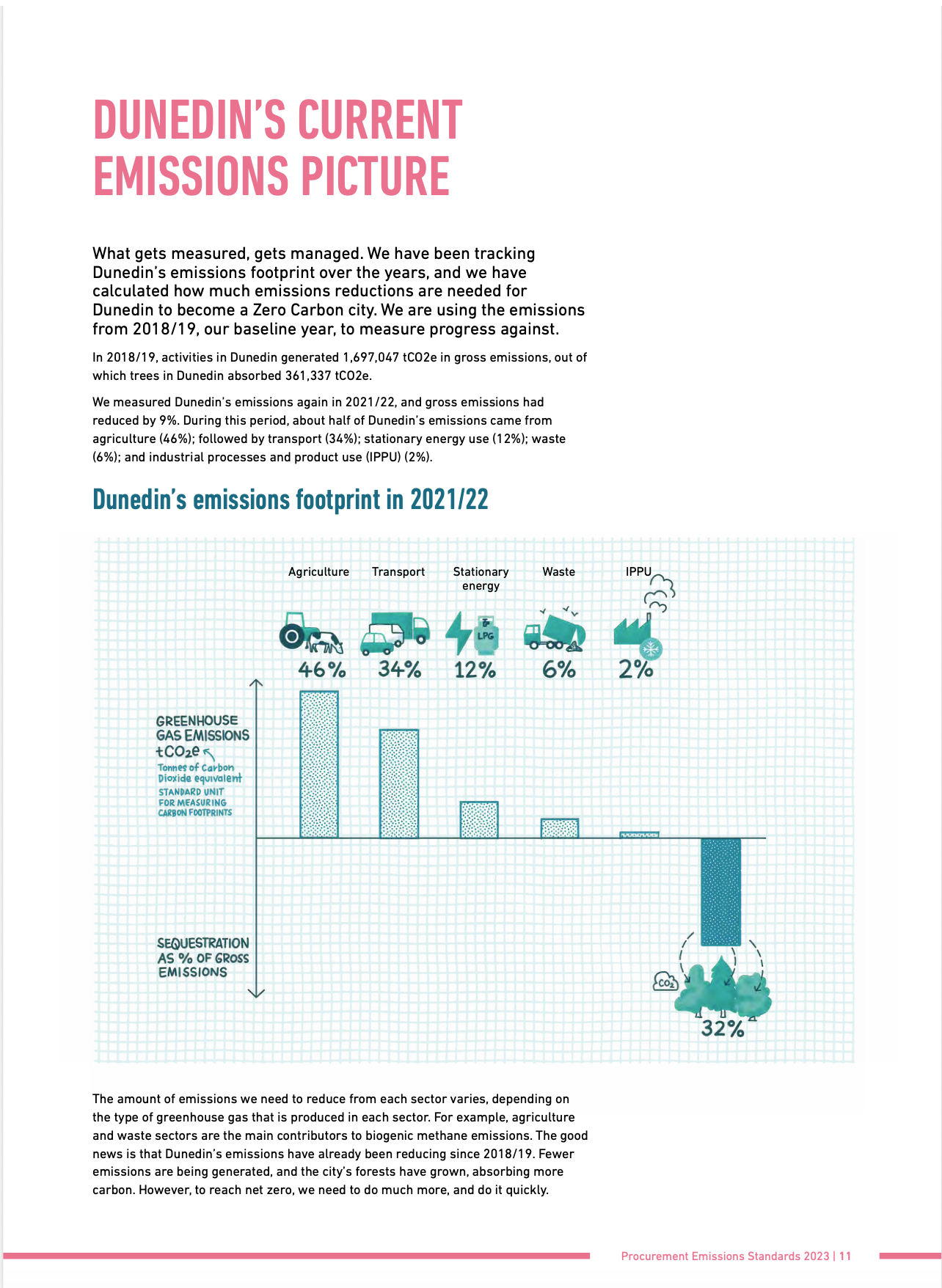
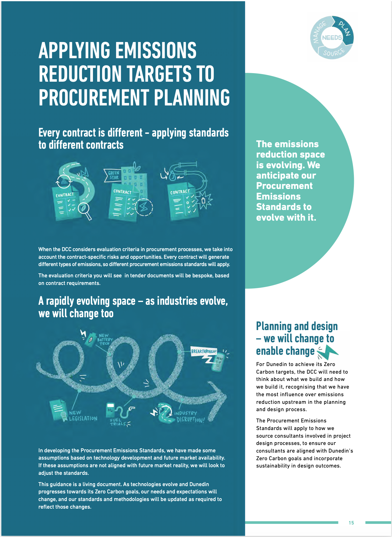
Making the final document: I collaborated with the graphic designer who used our structural mockup and my finished illustrations to build the official document.