
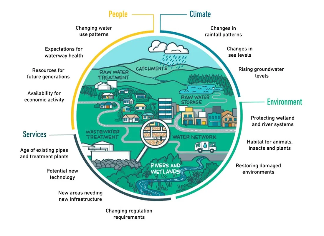
Making complex water science accessible
My client had completed a major project on how the region will manage and adapt its water services in the face of increasing complexity. They wanted to create a shorter, informative version of their highly detailed report so the local community could easily understand the plan, the paths forward, and why it mattered.
“I would definitely work with Lisa again. For a project this complex, it’s rare to find the specific skills in-house to make the technical details truly accessible to the public. Bringing in a visual specialist allowed us to deliver a quality guide that beautifully represents our work.”
— Project Lead
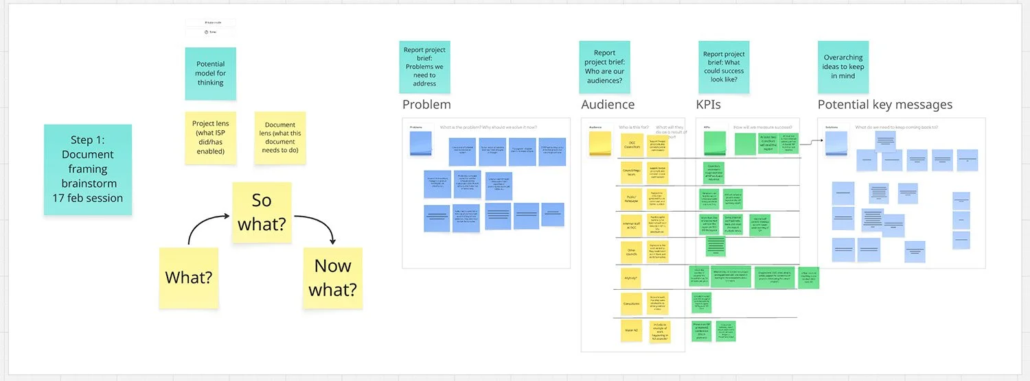
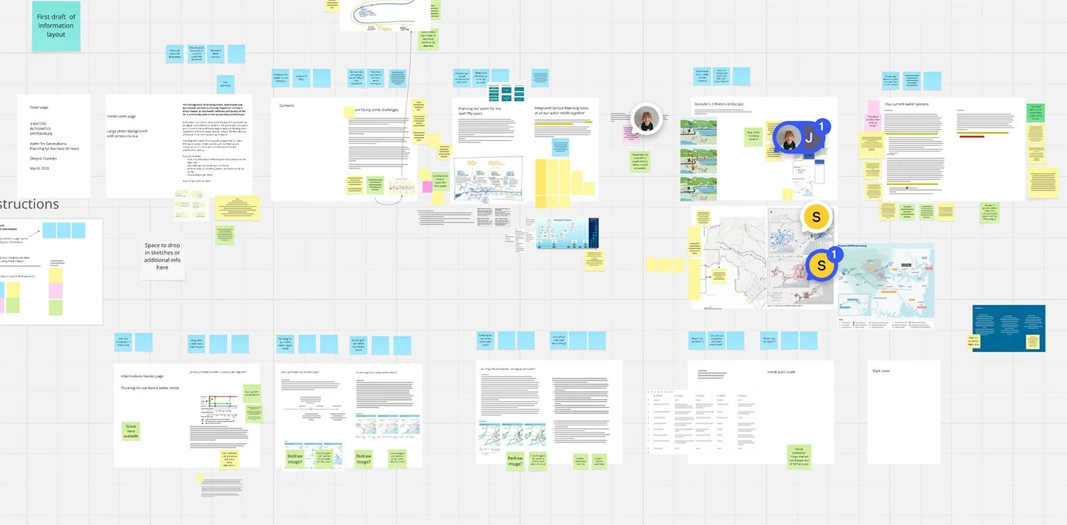
The story design process: Because the subject matter experts were leading the story, I set up an online workspace in Miro with a collaborative process for building their document. Together, we looked at who their audience was and what they needed and wanted. We then broke down their detailed information into sections that were easy to understand. We kept other departments informed about how the project was developing, bringing them in as needed.
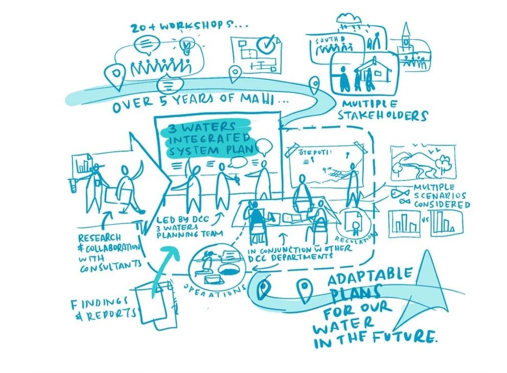
Making the illustrations: Once the project team was happy with the main story flow, we divided up the drawing tasks based on our strengths. I created custom illustrations to help people understand the project as a whole and what it means for them, while the technical team built the detailed regional water maps.
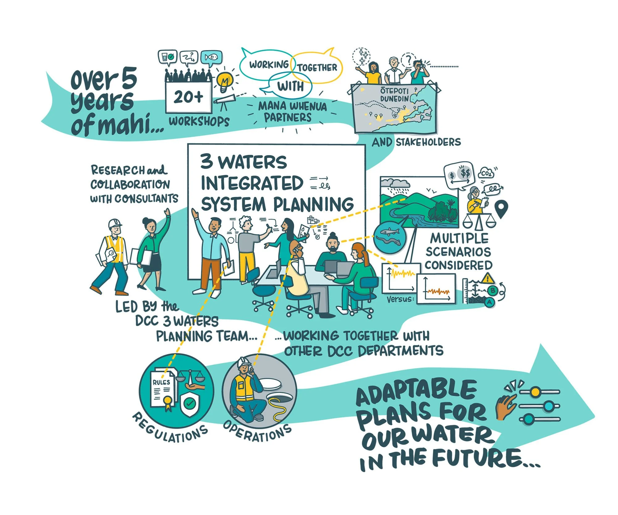
Developing useful ideas: When making illustrations I use rough sketches to develop ideas. This means the project team can quickly test them to ensure we’re telling the story in a way that suits the audience and their needs.
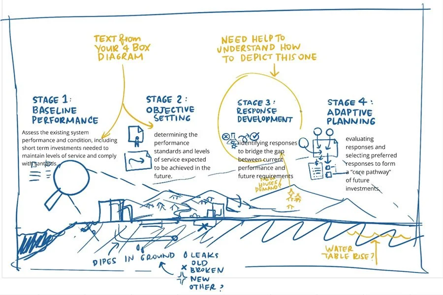
Stages illustration - Version 1
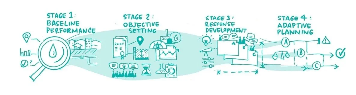
Stages illustration - Version 2
The internal communications department laid out the final document using our story board and final illustrations.
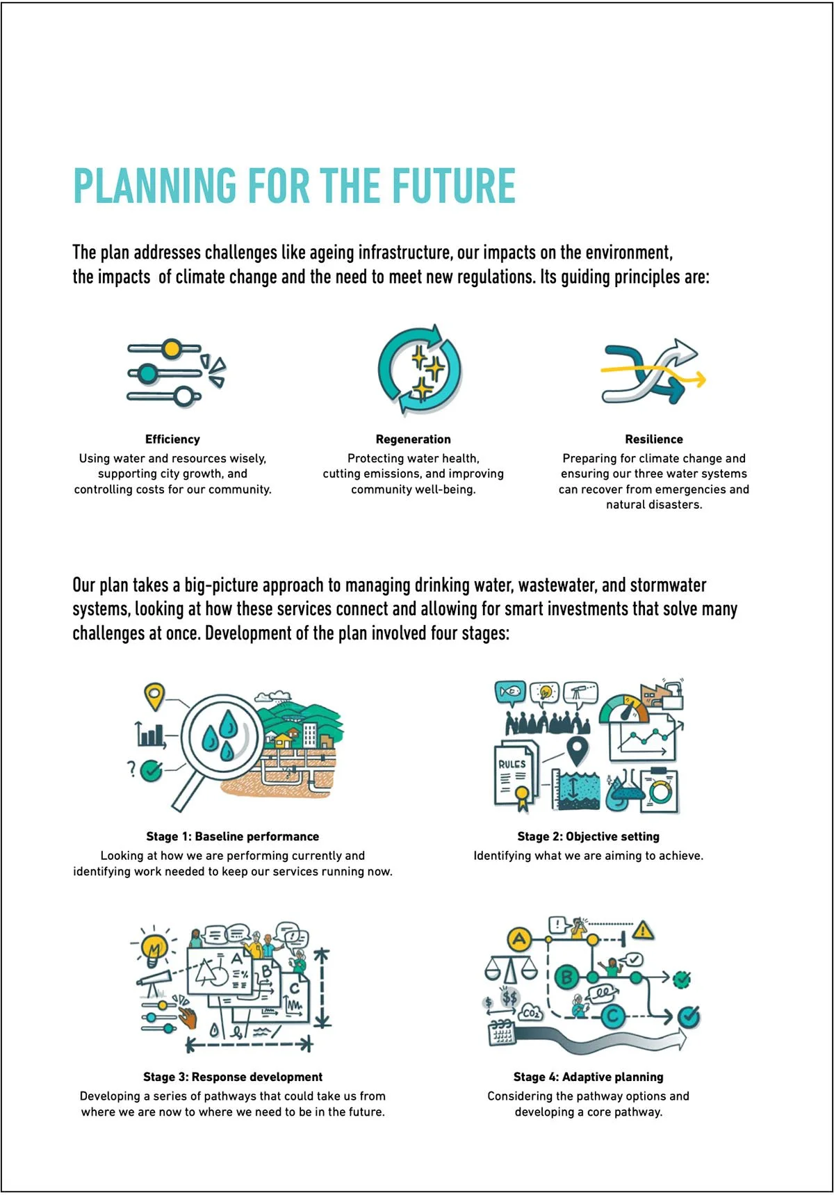
Stages illustration - Final version
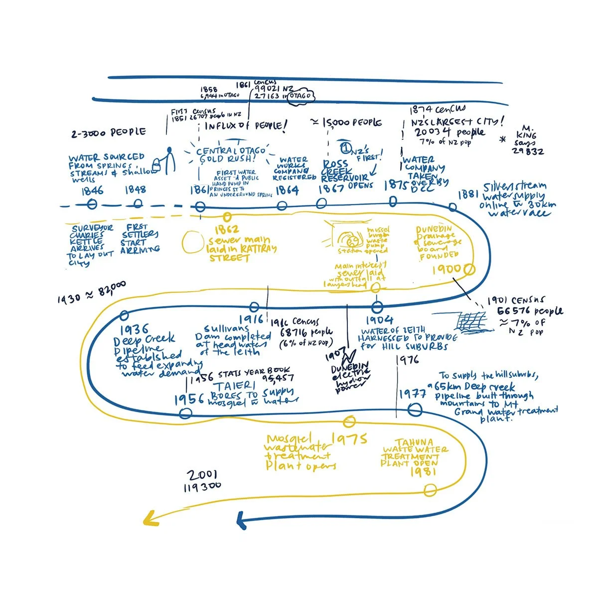
Testing ideas: Because a single diagram needs to carry a lot of information, getting it right can take a bit of testing. I tried different ways of showing these complex topics to figure out exactly how much detail to include. We then tested the final drawings with real people to make sure they were clear and doing the job we wanted them to.
Developing the idea - a timeline to show connected information
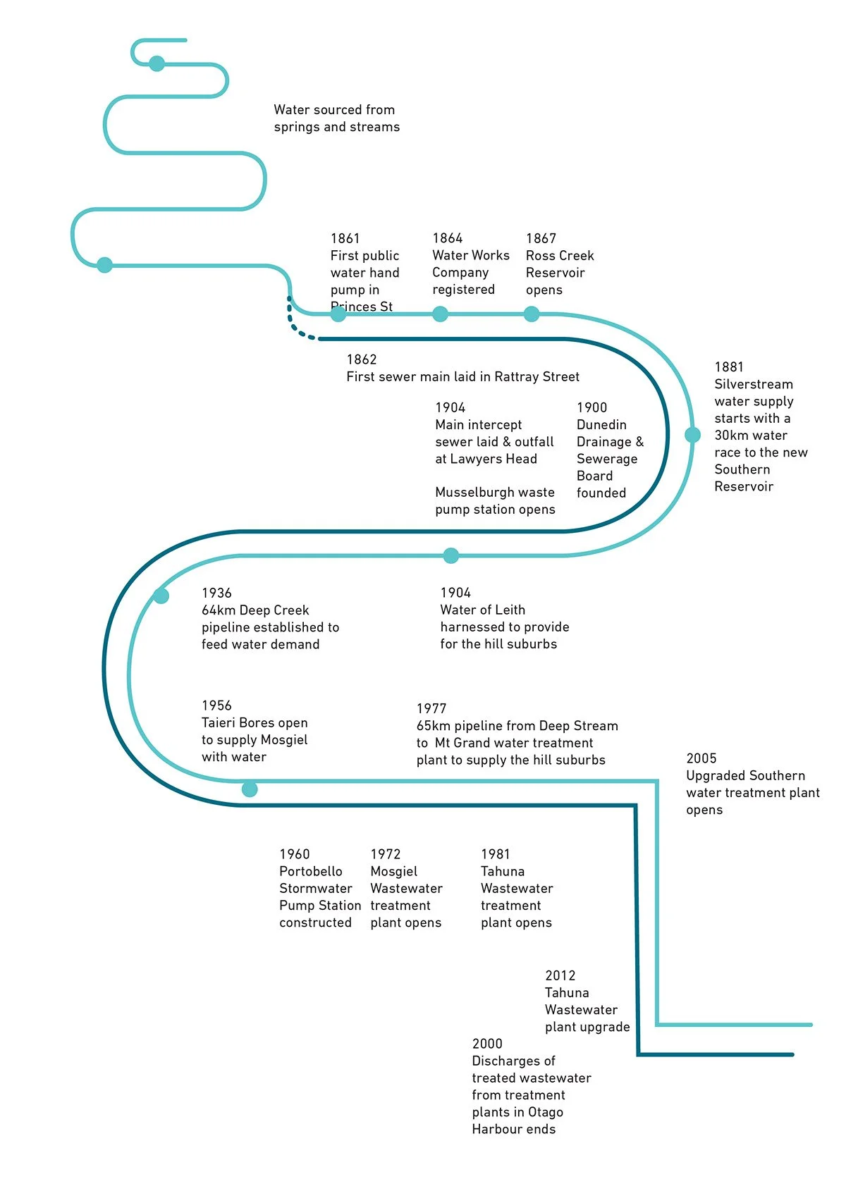
Building in Adobe Illustrator
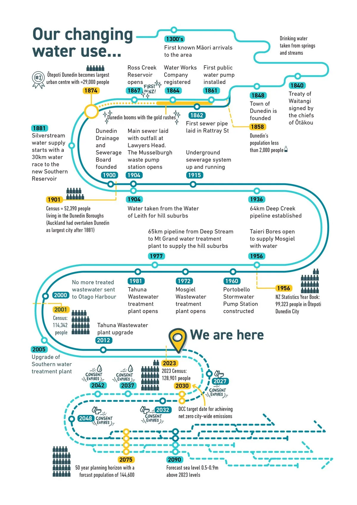
The final diagram - the history and future of water services in one page